Fashion Critic's Milan Shopping Report - Part 2, Viktor & Rolf Boutique
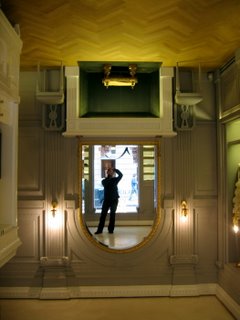
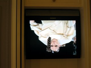
While I am not a big fan of Viktor & Rolf's designs (I do like some of their women's, not so much men's), I can appreciate the quirkiness they sometimes put into their work. Their first boutique in the world is no exception. One can't help but smile at the pure simplicity and ingenuity of the concept. They basically turned the whole interior upside down! The parquet "floor" is on the ceiling, with some chairs attached to it. Even the small TV showing V&R's fashion shows is upside down. It makes you involanterily twist your neck. The store itself is tiny, and selection is limited, but it's just a fun place to be in.
Here are some pictures I took.
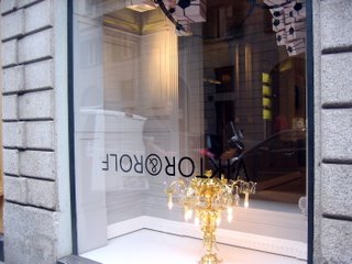
Window (check out the chandelier growing out of the floor... or the ceiling)
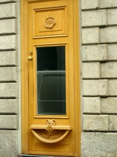
The door
Interior
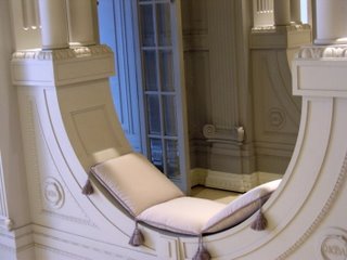
More interior
TV
Here are some pictures I took.
Window (check out the chandelier growing out of the floor... or the ceiling)

The door

Interior

More interior

TV


2 Comments:
can u tell me the exact address of tha boutique please?
thanks....e.
Hollywood definitely have good ideas to inspire ! Remember the guy dancing inside the room on the ceiling, upside down ,hehhehe...and the image of both is all Gilbert& George very clever indeed.
I love their art in how to combine ideas and make them your own
Post a Comment
<< Home